
In celebration of World Book Day 2023, for today only you can purchase Demon’s Blood for FREE on Amazon! Please do grab a copy if you don’t yet have one!
Paranormal, Science Fiction & Fantasy Author

In celebration of World Book Day 2023, for today only you can purchase Demon’s Blood for FREE on Amazon! Please do grab a copy if you don’t yet have one!
Today I am pleased to share with you an excerpt from my vampire novel Demon’s Blood.
Demon’s Blood is currently free on Amazon until Monday 31st October so please head over there and grab a copy!
I received the other week my book proof for the Demon’s Blood reprint! Overall I am very happy with how it came out and I really should have approved it by now but I’m a little stuck on one point and would appreciate your thoughts on it.

As you can see in the photo there is a fold line down the left hand side so when you open it, it folds all nicely. Now my question is about the text. It is currently aligned to the fold line so there is the same amount of space each side but it also gives the impression that it is off-centre if that makes sense? My question is should I leave it how it is or move it so the text aligns with the same spacing each side without taking the fold line into account?
Any thoughts anyone has on this would be very much appreciated as I’m really not sure what would look better.

To celebrate the release of my new novel Demon’s Life on Monday 4th November, there will be two promotions running on Amazon!
From Wednesday 30th October to Wednesday 6th November, Demon’s Blood will be on sale on Amazon.com for $0.99!
And from Monday 4th November to Friday 8th November, Never Change will be free to download world-wide!
Do please check out these promotions and Demon’s Life which is now available for pre-order! Thanks so much for your support!
It’s been a little while since my last post so I thought I would give an update as to where I am with my current works.
Demon’s Blood sequel
The proof-reading has now been completed so I’m currently going through it myself again to make absolutely sure I am happy with everything. Over the new few weeks I’m hoping to finally be able to confirm the title! It does have a title, I just want to reveal that to coincide with blurb and cover if possible. The cover and blurb are the next two things I will be working on. I’ve had the draft ideas for the cover for well over a year so I know exactly what I want on it so it shouldn’t take too long to do. I’m also working on some character-based posts which will lead up to the release date. The release date should be the latter part of the year. I’m hoping to confirm this in the next couple of weeks too.
Demon’s Blood universe
This project is turning out bigger than I had anticipated! I have at least 3 more novels planned which are set in the universe featuring various characters from it.
Perfect World 3
This is currently my work in progress so still very much in the early stages. I am aiming to get the draft done by the end of the year which scarily enough is not that far away now!
I’ve just started using Pinterest for my novels and have created this storyboard for my novel Demon’s Blood. It’ll provide some insight into my ideas, characters and settings for the story as well as the Demon’s Blood universe as a whole. Please do check it out 🙂

 Thane’s arms curved around his back and he felt the younger vampire trembling as he rested his head on Taku’s shoulder. So easily broken, Taku often forgot what it had been like in the beginning. For him things had been different, he reminded himself. He had already known what it felt like to take a life.
With Nagasaki in the grip of a bitter winter, two vampires struggle to hunt in the challenging conditions. When an opportunity to feed from a dying man presents itself, Taku insists that they take advantage of it. Yet his newly turned lover is left feeling devastated by their actions. Seeing Thane so distraught is more than Taku can bear and so he makes a decision to shield Thane as much as he can from the darker side to their existence. However his desire to protect Thane might one day cost him everything.
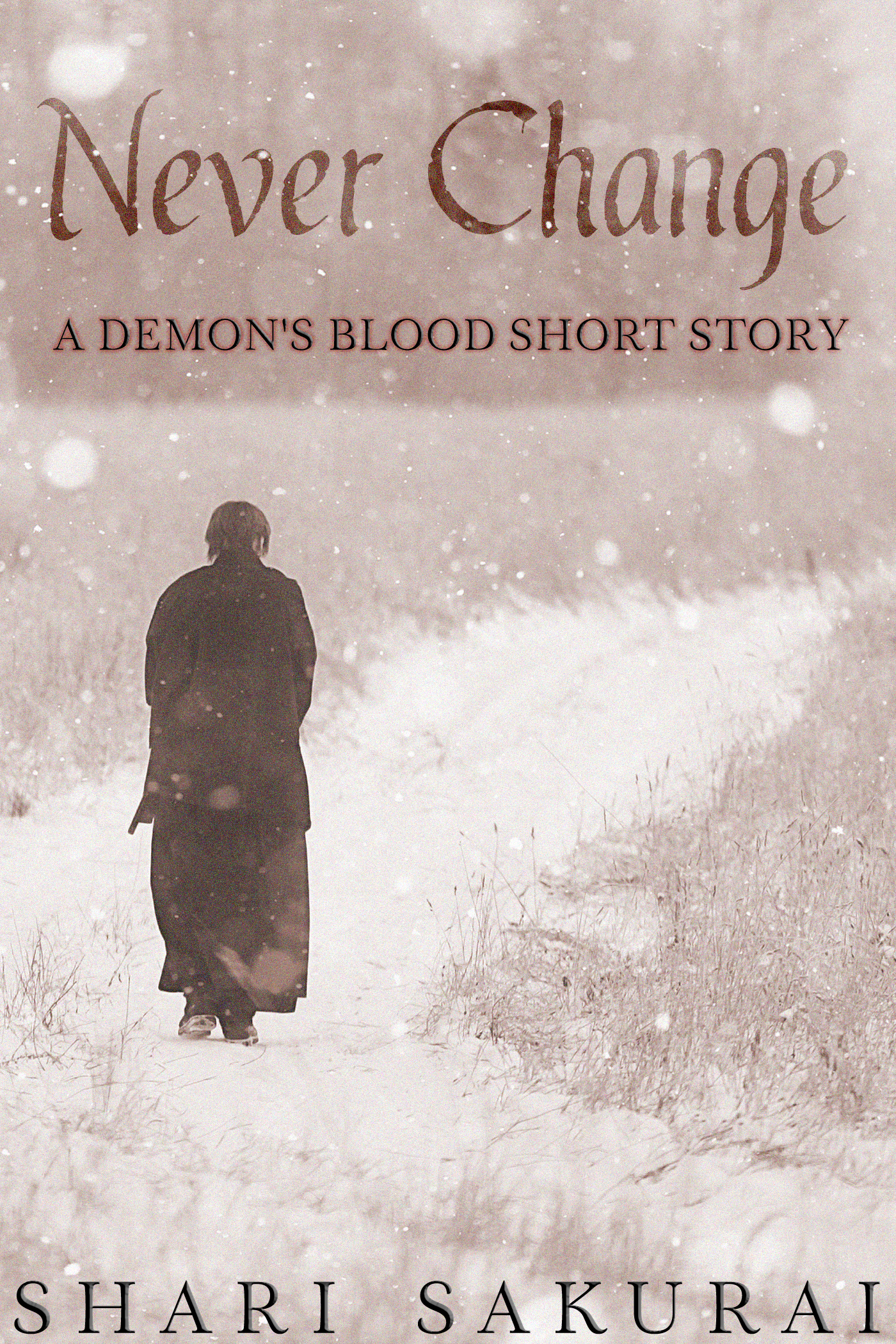
Never Change is a short story set in the Demon’s Blood universe.
Today I’m very excited to share with you all the new side project that I have been working on! Never Change is a short story set in my Demon’s Blood universe. It focuses on Thane’s first winter as a vampire and how he struggles with taking human lives. Never Change will be available to purchase on Amazon Kindle from 1st December 2018! The sequel to Demon’s Blood will be published in 2019.
Thane’s arms curved around his back and he felt the younger vampire trembling as he rested his head on Taku’s shoulder. So easily broken, Taku often forgot what it had been like in the beginning. For him things had been different, he reminded himself. He had already known what it felt like to take a life.
With Nagasaki in the grip of a bitter winter, two vampires struggle to hunt in the challenging conditions. When an opportunity to feed from a dying man presents itself, Taku insists that they take advantage of it. Yet his newly turned lover is left feeling devastated by their actions. Seeing Thane so distraught is more than Taku can bear and so he makes a decision to shield Thane as much as he can from the darker side to their existence. However his desire to protect Thane might one day cost him everything.
Never Change is a short story set in the Demon’s Blood universe.
It’s been nearly three weeks since New Era was released and I thought I would post this quick update on the series and also what will be next from me.
First of all I would like to thank everyone who has purchased New Era or read it on Kindle Unlimited. During the run up to release Perfect World was on promotion for free and I was amazed that it got to number 1 in one of its categories! So again thanks so much to everyone who downloaded it during the promotional period and made this possible.
I haven’t stopped writing since New Era was released. The next novel I am working on is the long-awaited sequel to Demon’s Blood. I am tentatively aiming for a January 2019 release for this. Over the next few months I’ll be posting more details about the release and also the cover reveal. I’m also working on the next instalment of my Perfect World series and hope to be able to release that in the earlier half of next year too! So a lot going on behind the scenes!
I am also aware that I am quite behind on my reviews, but I am working through these every day so there will be more reviews posted in the coming months. Submissions will hopefully reopen in January, but this will be confirmed later in the year.
Thanks again to everyone for your continued support, its truly appreciated 🙂

